


Vibe check
If this case study was a song, it would be...
Why?
I can't help but associate Shure's bright green with the iconic brat cover art, an album which was the soundtrack of my summer. In this case, B2b means back to back.
I can't help but associate Shure's bright green with the iconic brat cover art, an album which was the soundtrack of my summer. In this case, B2b means back to back.


What is QR Menu?

Online menu-design platform for restaurant owners

Users can design a scannable QR-powered digital menu.

Provides access to valuable business analytics & advanced customization
problem
Outdated Components
According to the company metrics, on average 10% of new users who start the onboarding process publish their QR menu.
Solution
Brand new onboarding process.
Redesigning onboarding to focus on intuitive menu customization, allowing users to publish a menu upon signup.
Impact
- Went live December 2021
- 30% increase in the percentage of new users who publish a menu
Toolkit
Adobe XD
Research
Heuristic evaluation
Evaluating old components.
I started by analyzing the current onboarding process, loosely following Nielsen's ten design principles to identify any usability issues.

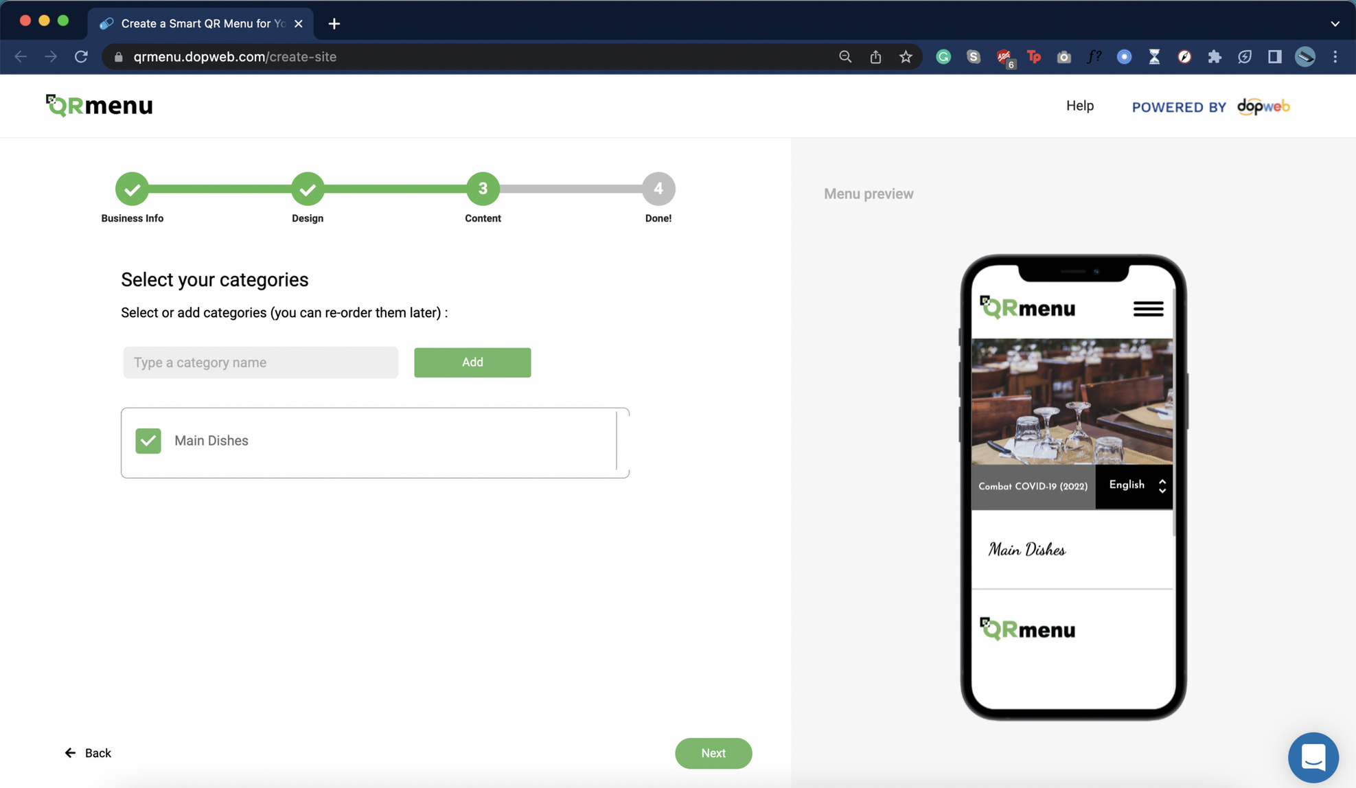
Previous onboarding process
Some of the issues I found were:


Usability issues found
Interview
I interviewed the head of marketing.
Since no clients were available for interviews, I interviewed the head of marketing, who brought most customers through direct advertising, and helped them with creating accounts/onboarding. The interview was semi-structured.
Interview Insights

Users were hesitant to sign up before beginning the onboarding process
There were bugs that interrupted the onboarding process
Users were confused since they could not see the menu
Most users are males 45+, with little to no experience with web design platforms
Users had difficulties navigating the platform after onboarding


Competitive analysis
What were other platforms doing?
I decided to perform a competitive analysis of the onboarding processes in 2 different design platforms:
- Wix - one of the world's leading web design services, targeting users with little to no web design experience.
- Online Menus - a QR menu design platform which targets business owners.

Define
I ideated solutions for each pain point.

No business type consideration


Provide more business types
No progress visibility
Progress bar
UI inconsistencies
Consistent buttons and screens
No menu visible/no customization
Add a menu visual, with basic customization options
Insufficient guidance/misleading CTAs
Clear directions with accurate CTAs
User persona
Meet Anthony.
Based on my research, I developed a user persona that demonstrates QR Menu's target clients' goals and pain points when it comes to the onboarding process.

Ideation + Iterations
Business goals consideration
How can I drastically increase publishing rates?
I realized that we could increase menu publishing rates by letting new users publish a menu as a step at the end of the onboarding process and moving the signup to the end. Thus, we identified two more opportunity areas:

Move sign-up to the end
Publish automatically with sign-up
Additional opportunity areas
Business goals consideration
I mapped out the user flow.
Users can customize their business type, menu language, theme, logo, banner, font combination, menu categories, items, and social media links. A signup button at the end prompts account creation, automatically publishing their menu.

Onboarding process user flow
Wireframes
It started from a rough sketch.
After getting feedback from the PM regarding the user flow, I created a few wireframes that show the vision I had for the layout of the onboarding process.

Early wireframes
Solution
Final Deisgns
6 big improvements!
1. I provided more business types.
I added additional business types as well as an "Other" option, since QR menu has different menu templates depending on the business type.

Business types screen
2. I added a progress bar.
I grouped the onboarding process into 4 steps, and chose a linear indicator with levels to add progress visibility.

Progress bar
3. I added a consistent buttons & screens.
I established a design system with consistent buttons, spacing, and typography. I also made sure to keep all of the screens in a similar format to avoid confusion and added a "Back" button.

spacing & buttons
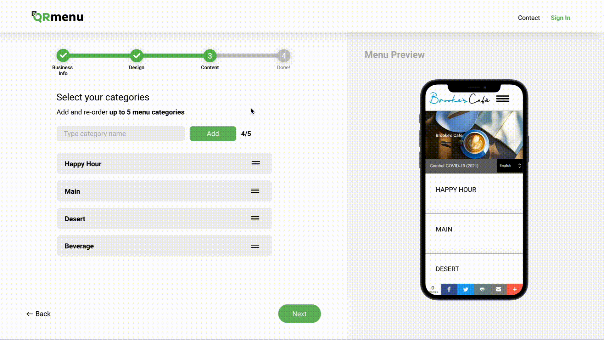
4. I added a menu visual & basic customization.
I added a clickable real-time menu preview and basic customization options for themes, categories, and items, turning the onboarding process into an interactive platform demo.

spacing & buttons
5. I added clear directions and accurate CTAs.
I added clear CTAs, which made the onboarding process intuitive and easy to complete and made sure to consider error handling and make actions reversible. I changed the terminology from "products" to "menu items."
Menu items screen
6. I made the menu publish automatically upon signup.
I made the sign-up process the last step. This allowed users to get a taste of the platform without creating an account and made onboarding more transparent and less time-consuming. Once users reach the sign-up, they already have an initial draft of their menu, which goes live automatically once they create an account/log in.

sign up screen
Conclusion
Impact
Results after 1 month.
30%↑
in new users who published at least one menu
98%
of users complete onboarding without help
100%
rollout rate
Live product
The first time my design was published :)
Below are screenshots of the live product.


next steps
Future opportunities.
Conduct remote usability testing
Collect qualitative user data
Continue iterating based on findings
Increase retention by redesigning the dashboard
Lessons Learned
The process is imperfect, and that's ok.

You can't do everything.
The main challenge I encountered was the aggressive timeline, which compelled me to prioritize the most vital tasks needed to complete the project by the desired deadline.

Sometimes you have to improvise.
Due to the lack of active users available for interview on such short notice, I interviewed the head of marketing, which provided me with just enough insight to understand what challenges QR Menu's clients might face.

Good communication = good design.
When my designs were developed for the first time, I quickly realized the importance of providing clear specifications and rules to make the developers' work easier. To address this, I created a simple design system, ensuring all relevant specifications were clearly highlighted.

Skills Unlocked

User
Research
Research

Visual
Design
Design

Working with Devs

Adobe XD Prorotyping
Read next
