Velo Academy
Photography learning platform
The idea for Velo was conceived by a working photographer: an online course to teach beginners his craft. As sole designer, I took it from first logo sketch to a complete course. Its centerpiece is an interactive camera simulator that lets beginners learn exposure by changing real settings and watching the photo respond.
- EdTech
- Web App
- 0 to 1
- Role
- Sole Designer
- Timeline
- March 2026 – September 2026
- Scope
- Brand, research, UX/UI, design system
- Team
- Instructor/founder/course content provider, PM, developer
- Toolkit
- Figma, Figma Make, Automatic.css
Impact
- Launched with 13% of trial users upgrading to paid in the first two weeks
- 70+ free trials in the first two weeks
The challenge
Getting beginners to stay, and to pay
Beginners give up on photography courses. And a paid course has to compete with free YouTube tutorials and well-known instructors. That gave Velo two goals, both aimed at one thing: getting trial users to pay.
- 01
Keep beginners engaged
Long enough to actually learn.
- 02
Earn trust without a famous name
Give them a reason to pay for a course from someone they don’t know.
Research
Beginners want to do, not watch
I audited Duolingo, MasterClass and Udemy, read through Reddit’s photography communities, and interviewed four very different beginners.
What other platforms got right
 Duolingo
- A quick first lesson before any setup, and clear progress.
- The cartoon look. Velo needed to feel serious.
 MasterClass
- A premium, dark, minimal feel.
- Passive video with nothing to do.
 Udemy
- Lessons, resources, and Q&A always in view.
- The clutter.
Who it’s for
- Focusedrecommended by me
Small businesses and creators
- A clear edge: it matches the instructor’s background in product photography.
- His existing product photos already cover the examples.
- They likely own a camera already, or will buy one as a business investment.
- A smaller market.
- Broadchosen
Any beginner
- A much bigger audience.
- Competes with everything free online.
- Requires a camera, which many beginners don’t own.
- More new example shoots, since most of the instructor’s photos are product and marketing shots.
The team decided to go broad to reach more people, so I designed the experience to work for any beginner, whatever they shoot.
What beginners told us
Practice makes it click.
Long, rushed lessons lose them.
Clutter distracts, hiding frustrates.
They look up the instructor first.
Brand
A brand built on photography
The research set the direction: dark, serious, and minimal, with none of the childish look or clutter learners disliked.
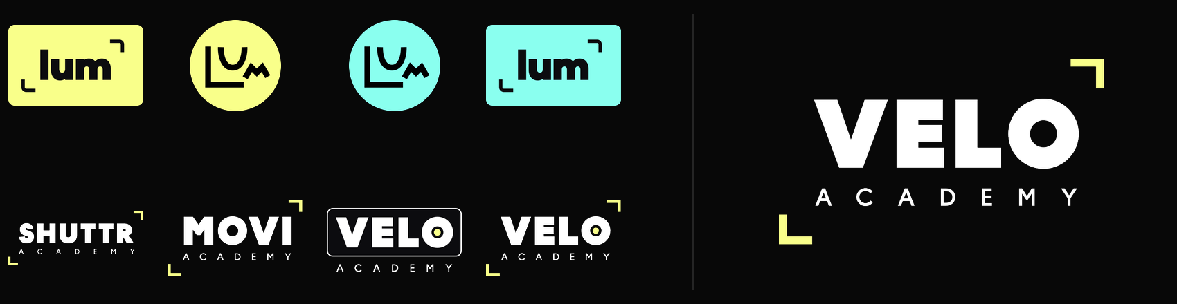
I explored several names and marks and landed on Velo Academy. Velo means veil in Spanish and Italian, a nod to the diffusion photographers use to soften light, and it hints at velocity, for quick learning.
Design system
A system the developer could build from
I built the style guide with Automatic.css, which plugs straight into Bricks, the builder our developer used. The colors, type and spacing carried into the build as-is, and every screen was assembled from the same components.
Neutrals
Primary
Feedback
Aa
Outfit · headings
Aa
Inter · body
Structure
Mapping the product
Before designing screens, I mapped the full product with the PM. Interviewees tuned out of long videos and learned best by doing, so every chapter is short and hands-on. Lessons started as a single list of steps, and we added chapters once they grew too long to scan. Learn (video, interactive reading), practice (field test), review (knowledge check). Premium adds an assignment with personal feedback from the instructor.
Key decisions
Each decision answers one of the two goals from the challenge.
Goal 01Keep beginners engaged
01A camera settings simulator
Interviewees learned by doing, so the course is full of interactive exercises, like comparisons and click-through cards. The camera simulator is the biggest one. Existing simulators are outdated, and ours lets students practice exposure before they ever pick up a camera.
- cartoon scenes, hard to read
Final design
- tells you if the exposure is right
- sun, clouds or indoors
- the photo changes in real time
- on a tripod or handheld
In testing, it was the part testers asked for more of.
With more time, I’d make it look more like a real camera, and let learners take a photo and see how it turns out.
02A home page that doesn’t overwhelm
Interviewees found cluttered platforms distracting, but hated hunting for things. I started with an AI draft in Figma Make, built from my design system, then iterated on it and turned it into components.
- AI first draft, from my design system
- no course structure yet
Testing showed it was still too complex. Testers checked progress in the sidebar and mostly cared which chapter they were on.
Final design
- chapters numbered 5.1, with their steps
- progress lives in the sidebar
With more time, I’d show the minutes left in a chapter instead of its total length, and bring back a next-chapter card.
Goal 02Earn trust without a famous name
03A free trial with no card
The first lesson is free, with no card required, so trying costs nothing and the teaching can sell itself. The other lessons stay visible but locked, so learners see what’s ahead without hitting a wall.
04Credibility up front
Learners look up the instructor before they buy, so I designed a credits section that leads with his work for artists like John Mayer and brands like Guitar Center.
Usability testing
Finding the next opportunity
Usability testing on the built course confirmed the platform worked:
5/5
test participants finished the first lesson with no friction
5/5
test participants loved the course’s interactive parts
4/5
test participants said they’d pay for a more interactive version
It also showed where to go next: testers enjoyed it, but none would pay for it as it was, only for a more interactive version. (The one holdout didn’t own a camera, but said she’d pay for a similar course built for phone photography.)
- On the interactive examples“I think the value of these is so high, I just feel like they could use a little more pushing.”Test participant
- On the lesson readings“This is really great information, but… it’s just a lot of scrolling and a lot of reading.”Test participant
- On paying for the course“…I would like to see a lot more interactive examples like the simulator.”Test participant
The direction was clear: make every lesson interactive and simple.
Lesson redesign
Making lessons interactive and simple
Partially shipped
The biggest problems testing found were in the lessons: content types blurred together, readings were text-heavy, and the interactive parts were easy to miss. The team shipped some of my fixes. The rest, like color-coded callouts, I built into a redesign of the first lesson.
- dense text, yellow everywhere
- softer highlights
- a title for every idea
- color-coded callouts: key terms, tips, mistakes, and what to do
The biggest fix was using more interactive components and visual examples. The components were already designed, but the lessons barely used them, so I recommended building lessons around them and cutting the text. The instructor did, and 13% of trial users upgraded in the first two weeks after launch.
The final product
What I learned
For a course, the content is the product. Most lessons were text-heavy with no clear hierarchy, so many testers watched the videos, skipped the readings, and only did the interactive parts. Next time I’d spend less time perfecting the structure and more reviewing lessons with the instructor.
Test with users earlier. Testing aligned the team faster than any internal discussion. Next time I’d put a single prototype lesson in front of users first.
Back recommendations with evidence. I pushed for a focused audience, but the team went broad, and testing showed the cost: the one tester who wouldn’t pay at all didn’t own a camera. Next time I’d make the case with research, like a quick survey or a landing-page test of both audiences.
Agree on a number, not just a direction. We wanted a return on the course but never set a conversion target, so we had nothing to measure the launch against. Next time I’d push for one before launch.